A creative director on the tools – Using strategy, stories, and research to create things*.
Specialising in brand and identity. Currently based in London.
*Digital things, physical things, conceptual things, printed things, experiential things.
Heaps of different things.
Here is some of my work at a glance:

Nationwide — Rebrand
Nationwide’s biggest rebrand in 30 years.
Logo. Colour Palette. Typography. Illustration. Everything.
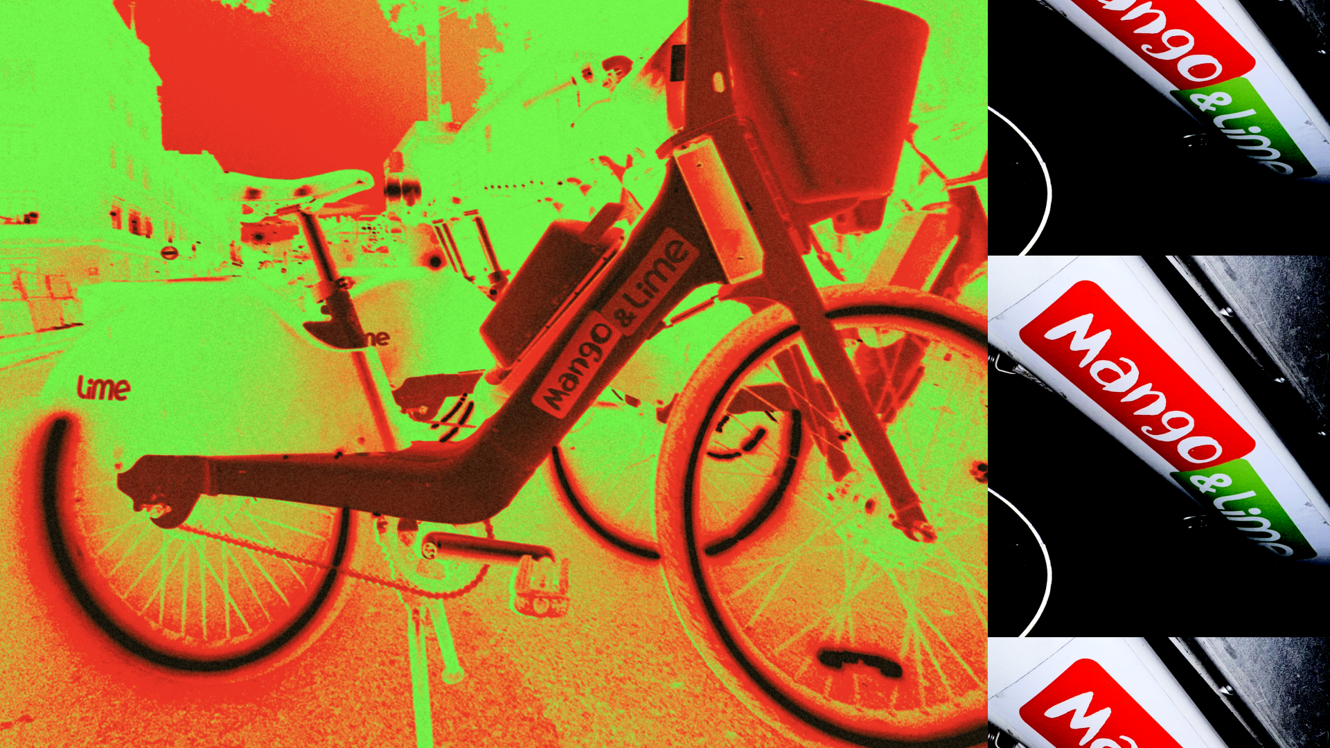
Nando’s X Lime Bike
To mark the return of Mango & Lime, Nando’s partnered with Lime Bikes, creating branded bikes and rewarding selfie-takers with freebies.

Nando’s X Saka
OOH flyposting for the Nando’s Saka Sauce.
No brand colours. No logos. No branding at all really.
And it went viral.

MOT3L — Branding
Brand identity for a new WEB3 and talent partnership consultancy — Bridging the gap between the worlds of entertainment and WEB3
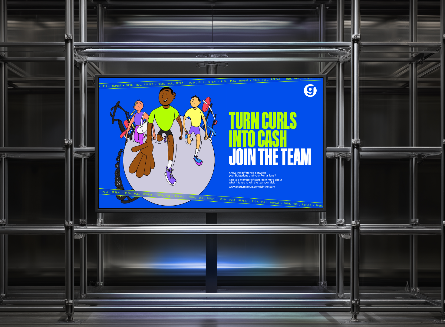
The Gym Group
Brand update — New colours, new illustration style, and new headline typeface.

Not On The High Street — Rebrand
The first change of brand since the online retailer launched in 2006.
Home to over 5,000 small businesses, the rebrand is centered around a new strategic positioning “Making More Moments of Joy”

PARALLEL — BRANDING AND OOH CAMPAIGN
Defining the brand for London-based brand and talent management company Parallel — including a series of OOH fly posters that were plastered around East London in the lead up to their launch.
The Butcher’s Table
Branding for a South London Butcher shop — Creating a look and feel that lends itself to a restaurant and deli, as much as a high welfare butchers.

MICROSOFT PIVOT
Identity for an event with a focus on AI and the future of business with new technology.

BT FULL FIBRE CAMPAIGN
Campaign art direction, turning icons associated with internet failures and load times, into relics of the past.

i70 PARTNERSHIPS LOGO
Monogram for property company.
Inspired by the idea of opening doors for people.
A 7 is created from the ‘open door icon’ seen on residential floor plans.
Habitat ‘THE ________ PRODUCT ”
New art direction, creating a distinctive brand asset.
Making the visual language be defined by it’s products.
Colours picked based on the products in the photo.
The copy uses an ‘interrupter’.


WWE + BT SPORT
The Drum Awards:
Best Integrated Cross-Channel Cross Media
Campaign identity for activations and film supers/titles for the WWE’s move to BT Sport.

THE STONEBRIDGE SERIES
Annual table tennis event identity.

WT 5-A-SIDE IDENTITY
Branding for Wunderman Thompson’s Tuesday night football. Taking full kit wanker to the next level with stats, data and league tables. And an identity system changing every week depending on the game.

EE WELCOME JOURNEY
Creating a best in class welcome journey for customers joining EE. From packaging and postage to on-boarding emails and cinematic MMS

BT EARLY LIFE
A collection of creative concepts and design ideas to improve the experience of BT customers within their first 60 days of signing up.

MICROSOFT CUSTOMER IMMERSION WORKSHOP
Event identity for a Microsoft workshop. The immersive workshops targeted CTO’s, to help educate them on the ins and outs of Microsoft’s product offering.

IKEA TOY BOX
An interactive mobile app that brings cardboard waste to life — Debuted on stage at Cannes, IKEA Toy Box facilitates creative play, empowering kids to transform an old box into something new

WUNDERMAN THOMPSON — COLLISION
Creating the identity for a way-of-working, confined by the typefaces Arial and Roboto and the shape of a plus.
The Wunderman Thompson inspiration mark [plus symbol] is the foundation for the collision logo. This grid helped define the identity for each step of Collision.


EAT SLOW HOMIE — CITY GUIDES
Instagram account morphed into food guides. Curated, designed and distributed by me.

MICROSOFT — WORK X LIFE
A campaign that was built around millennials demanding a work life balance. With the Microsoft Surface and office 365 work and life is a collaboration.
Filmed in Pinewood Studios we created the world’s largest flat-lay from thousands of meaningful objects belonging to one real-life entrepreneur.
Work and life, fitting perfectly together.

WT — INSPIRED AT THE BARBICAN
Event identity for Wunderman Thompsons first event after the merge. Tote bags were made. 3 different ones. Actually made.

WUNDERMAN CHRISTMAS CARD ‘18
Wunderman worked with Bloody Good Period to help end ‘period poverty’. Decorative tampons were distributed to clients and for every decoration tagged @WundermanUK the agency donated a box of period products to BGP. The custom typography was created using tampons.

WUNDERMAN CHRISTMAS CARD ‘17
A series of Christmas LP covers where I had to “Create something the client would never buy” — No logos, abstract and tasteful with only a subtle nod to Christmas.

INCA RESTAURANT
Restaurant identity for a bizarre combination of Southern Italian and Peruvian, based in the heart of Williamsburg.
